


In this article, we discuss how to use className with styled-components. Styled-components is a CSS in JS library, which allows you to write CSS styles in ES6 template literals. If you are not familiar with styled-components, you can learn the basics here.
I am a fan of styled components majorly because:
- I don't have to worry about style leaking
- Dynamic styling based on props passed to components
- and the best part of it all is I don't have to maintain multiple CSS files
But the need to pass classNames occasionally arises, which we will see just now. We are going to look at styling a badge component based on the className given to it, as shown below;
First, install styled-components in your project,
npm install styled-components
Next, create a Badge component with dynamic props attached to it. We can do so using the attrs object. It takes a function that receives props from the component.
The most common use case of attrs is when every instance of a styled component needs to have that prop. Here is a simple example to understand how it works;
export const TextInput = styled.input.attrs(() => ({
  type: 'text'
})`
/* existing styling... */
`

<TextInput placeholder='Enter name' />
So each time an instance of TextInput gets invoked, you don't have to specify the type. You can also pass dynamic props, as we will see in our <Badge /> component
import styled from "styled-components";

export const Badge = styled.div.attrs((props) => ({
  className: props.className
}))`
  width: fit-content;
  padding: 2px 10px;
  border-radius: 16px;
  display: grid;
  place-items: center;
  font-size: 14px;
`
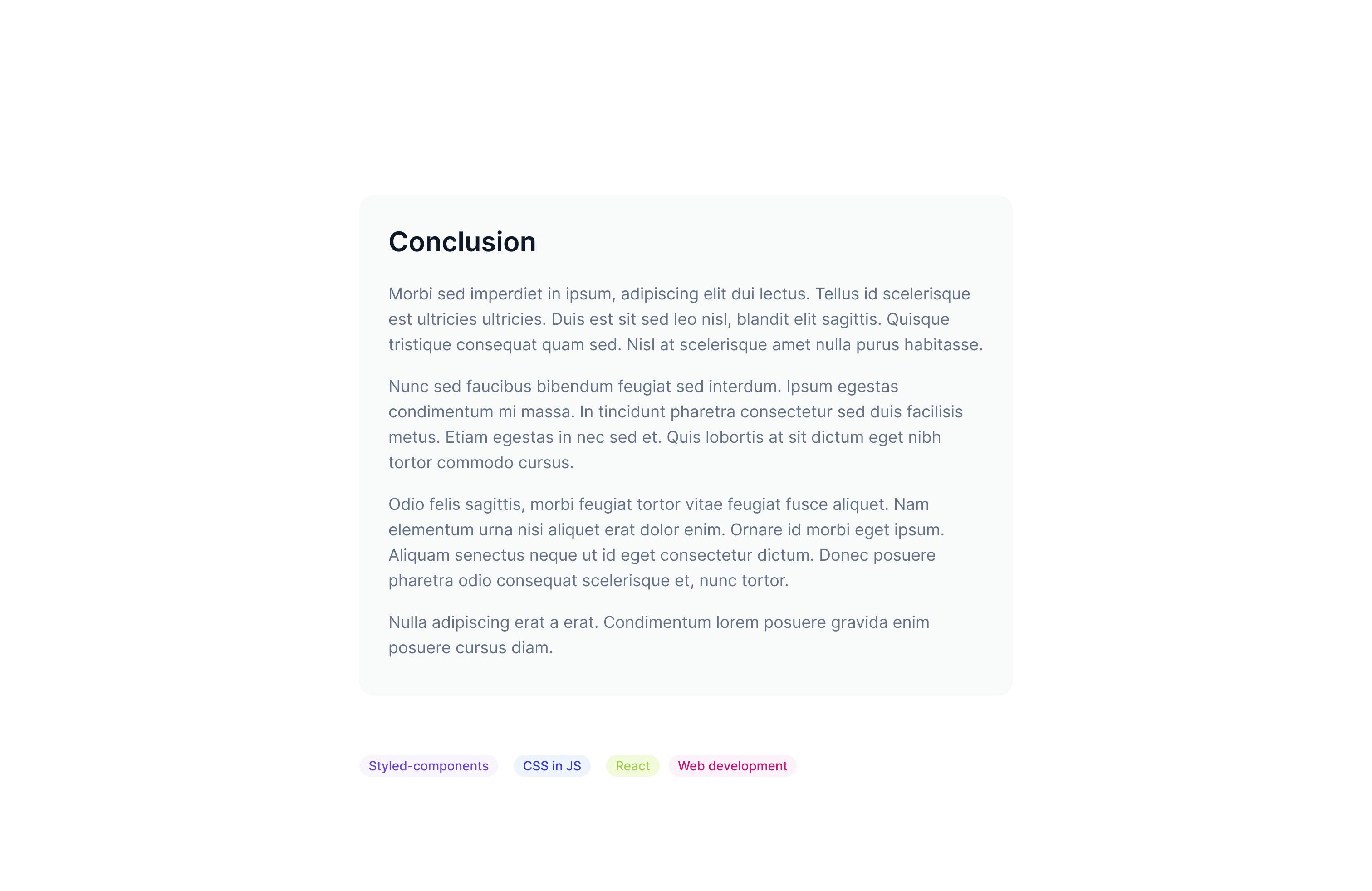
So now we can write regular CSS with classNames inside our <Badge /> component;
export const Badge = styled.div.attrs((props) => ({
  className: props.className
}))`
/* ...existing styles */

  &.react {
    background-color: #f2fbdc;
    color: #a7c957;
  }

  &.styled-components {
    background-color: #f9f5ff;
    color: #6941c6;
   }

  &.web-dev {
    background-color: #fdf2fa;
    color: #c11574;
  }
`;
Inside App.js we can use our <Badge /> component,
import { Badge, BadgeWrapper } from "./App.styles";

export default function App() {
  return (
      ...
      <BadgeWrapper>
        <Badge className="react">React</Badge>
        <Badge className="styled-components">Styled-components</Badge>
      </BadgeWrapper>
    </Wrapper>
  );
}
And that's it. We can also specify static props that will act as our default className in case an instance of our component does not have a className specified.
export const Badge = styled.div.attrs((props) => ({
  className: props.className || "default"
}))`
  width: fit-content;
  padding: 2px 10px;
  border-radius: 16px;
  display: grid;
  place-items: center;
  font-size: 14px;

&.default {
    background-color: #eef4ff;
    color: #3538cd;
  }

&.react {
    background-color: #f2fbdc;
    color: #a7c957;
  }

/* ...existing styles */
`
So the <Badge /> component will render with the default className,
<BadgeWrapper>
        <Badge className="react">React</Badge>
        <Badge className="styled-components">Styled-components</Badge>
        <Badge>Web development</Badge>
</BadgeWrapper>
You can also access the complete code of this tutorial, with styling, here